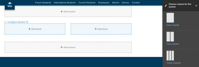
Sections
Welcome to the Drupal 10 block demo page. In D10, the layout tab allows you to add new "sections" which are horizontal containers. You can choose different layouts:
- one column
- two column
- three column
- four column
You can assign a visible centered title to a section. And you can add a background colour background to a section.
You place different kinds of blocks inside the sections. If you want three columns of text or CTAs, you create a three-column section and place individual text blocks or CTAs in each column.
You can even stack multiple blocks in each column. This is a departure from how 3 column text or CTAs was achieved in Drupal 7.
Below is an assortment of blocks in various column layouts.
Full-width section
About this section
This is a full-width section with. The section title "Full-width section" is set to display. Naming section and using the centred heading is optional. Background colours are set at the section level. There are two shades of blue to choose from: Mariners Blue (used here) and VIU Blue.
Best practices for coloured backgrounds
- Use sparingly. Coloured backgrounds should make up no more than 20% of your page.
- Do not use for text heavy content.
- Avoid using link text over coloured backgrounds.
- Be careful with photos and backgrounds. Mariners Blue rarely works with photos. VIU Blue is a little better.
Three-column section
How to use columns
Columns are good for content with minimal text.
You can stack blocks
But should you? This column is made of two stacked blocks. It's fine to stack blocks in a column, but be careful your page doesn't become too cluttered.
Tip
If you want multiple rows of three-column layouts with each row lined up nicely, add new sections for each row.
Ideas stand out
Columns can be a great way to make your content stand out.
Got two or three important rules to convey? Give them each a heading and put them in columns.
Don't do this
The heading in this block is the block title with the "display title" option select. This heading is too large for a column layout. The other columns are H3 headings assigned within the body of the block. That should be the max size for column headings.
Also, in columns, always strive for consistency: the same heading styles and similar text length creates a clean column layout. This column is now also too text-heavy.
How to choose the right section
Content determines section choice
These section options help us create interesting pages, but we need to make layout choices that strengthen our message. Some layout choices will make your message more difficult to understand. For example, a lot of text in a three-column structure can be hard to read. Here are a few content and section pairings to guide you.
- two or more paragraphs of text: single column section
- text broken down into headings and short (one sentence) ideas: two or three column sections
- one photo and one or two paragraphs of text: two column sections
- two or more images: two, three, or four column sections
If you want that interesting layout with columns and coloured backgrounds, think about how you can adjust your content to convey your message in short-easy-to-follow snippets. This is a good practice for the web.
Blocks

Flex CTAs
Flex CTAs work the same as they did in Drupal 7, except for how they are added. Now you place individual Flex CTA blocks in sections.
Options!
You can customize your CTA in the following ways:
- show or hide the title
- use an image or not
- center the cta text
- Hhide the button, which links the title or image instead
- add a link or not

This last Flex CTA uses the text center option. You center text in the editor, and the title and link will also center nicely.
Flex CTA in a single column
Add colour to draw attention
A Flex CTA it in a single column section with a coloured background is a great way to draw attention to important information. This section and block combination is the same as the "callout box" in Drupal 7.
Collapsible groups
Just like D7 you can create a collapsible group and format it either as an accordion or a group of tabs!
Like the other blocks mentioned previously, you can place this accordion group in any column of a section. So you could have two accoridions side by side in a 2 column section if you wish!
Anything you can put in a basic block you can add here too!

Collapsible group in tab format
Finished inputting all your content and want to switch to tabs or back? No problem, it's just an option.
Super easy to work with and edit!
Only use tabs when you have a few items. No more than four items for tabs. If your screen converts your list of tabs to multiple lines, your users may miss important details.

Block Image CTA
The Block Image CTA is back to allow large image background calls-to-action with several options such as: being full browser height, dark text on white washed image or white text on a dark washed image, text pull to the left, right, center or none, and an optional button.
A great way to break up text and add a punch to the page!
I'll use this Basic Block to introduce another variation of the Block Image CTA below. These two are placed in the same single column Section.

Not full width
Want a Block Image CTA but prefer not full width? Now you can even do this by not setting the containing section to full-width! You also don't need the button below, it's optional.
Col Size
You can also set the % ratio for the columns. Here have a Section with two columns in a 25%/75% split.
In the other column you'll see a Photo Gallery block. These can be put in any Section column too and will size their thumbs accordingly.
Photo Gallery Block
Some optional intro text allows a little lead in. This is the Photo Gallery Block. Place in any Section column, it's flexible.


Last ones
A few more blocks and we're done! Next up we have:
- Social Media Links - fill in the links you have and it will display only those.
- Contact block - suited for a staff page where a bunch of these are added to a layout.
- Image Link - suited for a layout of card style image links to different parts of your site.

Dr. John Smith
A little body text to give an intro of your contact. Their background and experiences and what they do now!